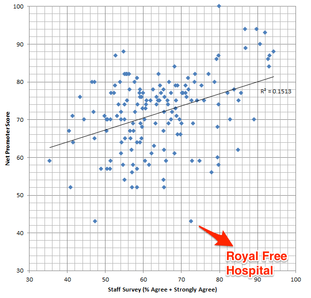
I worked at Royal Free Hospital for one year. When the 1st National Friends and Family test was published at the end of July 2013, I was surprised that Royal Free Hospital had the lowest net promoter score. I have worked in many hospitals and I actually thought that patients were treated reasonably well. In fact in the 2012 National Staff Survey when asked: ‘If a friend or relative needed treatment I would be happy with the standard of care provided by this organisation’, 72.5% answered ‘Agree/ Strongly Agree’ which was in the 4th quartile of performance.
So I asked myself a question, is there are correlation between the ‘Friends and Family test’ and the ‘NHS Staff Survey’?
I took both datasets, combined them and ran a linear regression analysis.
As you can see, the R-squared value is 0.1513 which represents a small positive correlation. I’m afraid that my statistics is not up to scratch to ask if this is statistically significant.
Interestingly, my old hospital does look to be an outlier.
I don’t know what this means but a few things but there are a few things to keep in mind
- The response rate for the friends and family tests for inpatients was only 10% at Royal Free Hospital
- The net promoter score is calculated very differently from the NHS Staff Survey (please see links above for an explanation).
From the website:
Those that say they are ‘extremely likely’ are counted as promoters. ‘Likely’ is neutral, ‘neither unlikely nor likely’, ‘unlikely’ and ‘extremely unlikely’ are all counted as detractors.
I welcome others to analyse this data. The sources and methods on how the raw data was collected and calculated are available from the sources (links above).
You can download my Excel Spreadsheet: NHS Staff Survey vs Friends Family or LibreOffice Spreadsheet
Any thoughts?
Update: 0734 19/08/2013
This post has generated quite a bit of interest with a lot of talk about sample sizes and response rates.
I wonder if someone able to create dynamic graph where the user can filter by the sample size and when mouse-overed, the tooltip will show the hospital the data pointrefers too? Maybe the size of the data point can correspond to sample size too (like a bubble graph?). All help greatly appreciated.
